

About
Schmooze is a Gen Z dating app that matches you on personality, not just looks. You can swipe on memes, search with AI, or talk to a AI matchmaker. It picks up on your vibe and finds people who get you. Grew to 2.6M+ downloads and 300K+ MAU, with 20-25% of them using it daily.

Role:
Team:
Timeline:
Desc:
The challenge
At Schmooze, two things moved the product more than anything else: how many people completed their profile, and how good those profiles were. Better profiles meant better matches. It also helped reduce CAC, because more of the people we paid to get became active users.
Where it broke: People dropped off at different points in onboarding, for different reasons. Optional steps got skipped, some screens confused people, and some asked for effort without giving much back. The result was low completion and thin profiles. This isn't one fix done. It took many small experiments across the flow
The leaky funnel
About 30% of people dropped off during onboarding. It was one long line of questions, and some steps were optional. In a long line, people skip the optional ones. Skipped steps meant thin profiles, thin profiles meant worse matches, and people who don't get good matches leave.
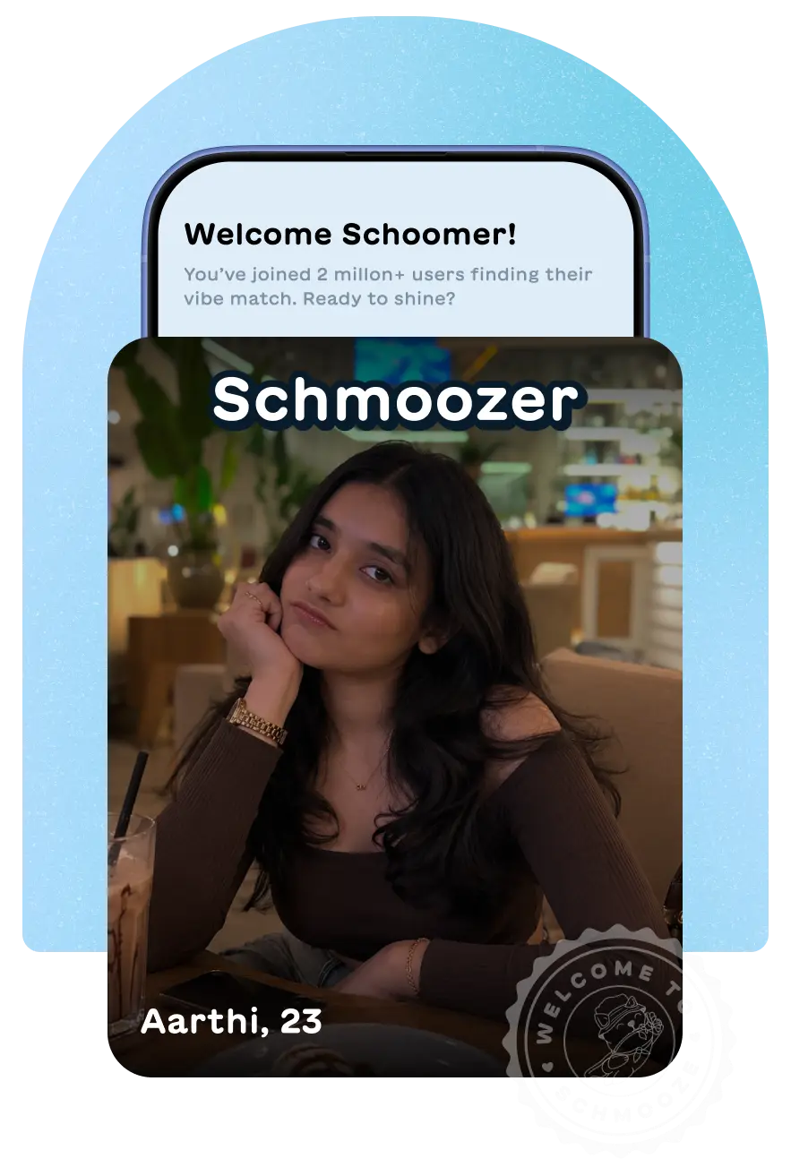
Approach: I split the flow into chapters. Treat it as a storytelling, not a form. I kept the community vibe, so it felt like joining something and every chapter ended with a small win. We also improved the save speed, so that next step load immediately, If user close the app & reopen, modal shows up with where they left & how far to go.


Short onboarding experiment: We had tried a stripped-down version earlier. It got people through faster, but left thin profiles and worse matches. So I went with a longer flow that felt better over a shorter one with poor profile & match quality.
Impact: Onboarding drop-off came down from about 30% to around 18%. Profile quality went up too. Verification among women users went up by 6% from 43%.
Lesson: People will put up with a longer onboarding if the storytelling is engaging and smooth. Length wasn't the problem. Friction and boredom were.
Protecting users from their own taps
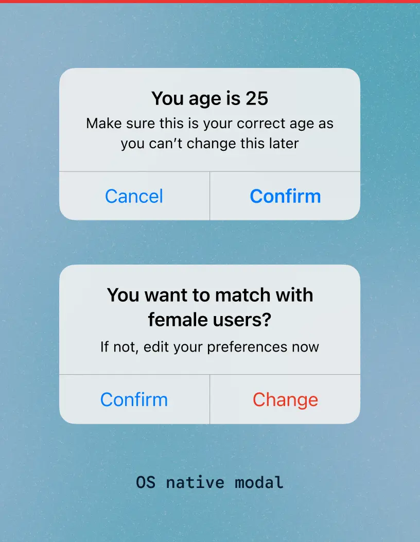
The problem: Support kept getting the same requests: change my age, my gender, my match settings. Age can't be changed later, and a wrong setting means the wrong matches. On top of that, about 35% of people picked age ranges far too wide for good matches. When I dug in, I found three causes.
The default system dialogs had tiny text and two grey buttons, and people tapped straight through. I replaced them with custom ones: a clear layout, an icon, plain language and bigger touch targets. The age dialog says "You are 25. Make sure this is your correct age as you can't change this later", and I put Yes on the left. Most people tap the right-hand button by habit, so anyone who didn't read lands on No and gets a second look. It costs a careful reader one deliberate tap, and saves the people who rush.
What happened. This alone significantly reduced customer support tickets from users asking to change their gender and age settings.

We treated the age range as a safety issue, not just a UX one. A 20-year-old searching 20 to 40 gets worse matches. So a tooltip now suggests a tighter range based on your own age. It suggests, it never blocks, so the choice stays yours. Among weekly active users, over-wide ranges fell from about 35% to around 22%.
Lesson: People tap on muscle memory, not careful reading. Sometimes you have to design for that habit and counter it, instead of expecting users to slow down.
Notification access
Only about 62% of people allowed notifications, and those are what bring people back: a new match, a new message.
Evolution: First we used GIF in notification permissio. Later I revamped it with informative visuals: a real-looking message from a match, a clear Allow button, and a quiet Skip so it never felt forced. Seeing exactly what they'd get made the value clear.

I shipped it directly instead of A/B, since i saw informative graphic yield better result from other experiment. Acceptance went from about 62% to around 78%. It's a before and after, not a controlled test, but the jump was big enough to trust.
Reflection: People don't refuse notifications because they hate them. They refuse because they can't see what they'd get.
The blank canvas
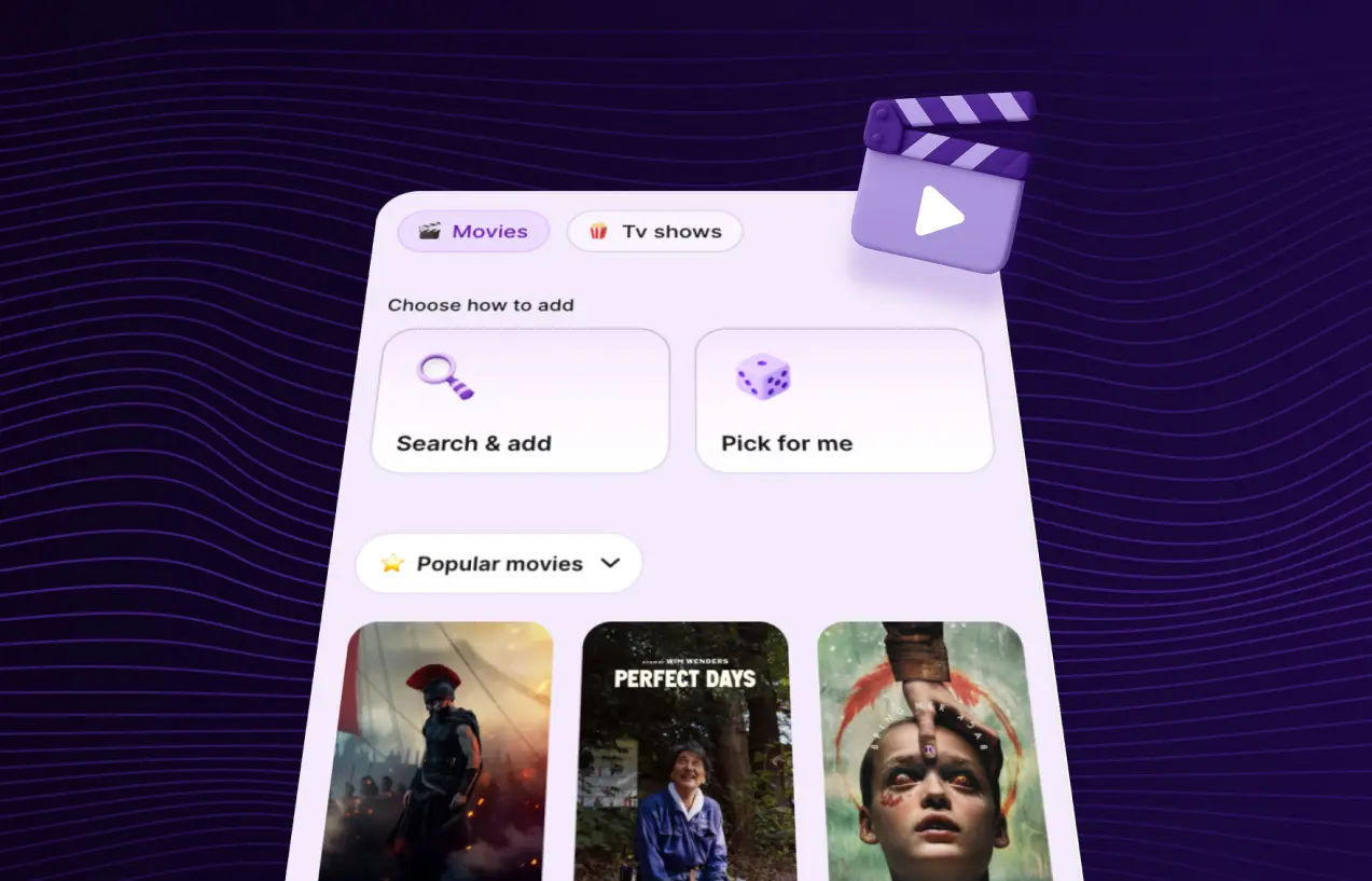
Problem:The bingelist (shows & movies) and playlist (music) sections tell the algorithm what you like. But they handed people an empty field and a blinking cursor. It's like a stranger asking "so, what music are you into?" or "fav movies" People stalled for 3 to 5 minutes, and only 55% completed the section.
Starting small: I wanted preset suggestions in every slot. With limited engineering time, the product team decided to launch smaller: no presets, just a fixed list of 50 titles people could shuffle through. I warned that everyone would land on the same few titles and profiles would start to look alike. The team expected people to use the list as a starting point and add their own.I let it ship and said I'd measure after launch.
Verifying hypothesis: After launch I opened profiles in our internal tool. The same movies kept repeating, and the playlist section had the same problem. That was the risk I'd flagged, so the next conversation was easy. It was data, not my opinion against theirs.
Approach: I replaced the fixed list with four presets people could keep, swap or shuffle: a trending movie, a trending show, a classic, and an animated or superhero pick. Rules keep it varied: no two people get the same first set, no set is all one format, each has a movie, a series and a non-English title, and each slot refreshes monthly from a pool of 100.
Impact: Some people shuffled and picked, some added their own, and some typed everything, so I kept manual search. UXCam recordings showed some never noticed the shuffle button, so I added a tooltip that points to it. Section completion went from 55% to 82% in the first week, people shuffled 4 to 8 times on average, and profiles no longer looked alike when I reviewing profiles. The same pattern now runs the playlist section.
Lesson: The job wasn't getting people to hand over data. It was removing the blank page. Give someone a starting point and they'll edit it.
The photo cliff


The underage problem
What happened: Every day, 7 to 10% of signups were underage, and half of them were faking an 18+ birthday. This was a legal and moral problem more than a metrics one.
How it was: We first let underage users in, but matched them only with each other. Most deleted their accounts within a week or two, and some told us they wanted an 18+ pool. It was a legal risk too, so we stopped serving underage users and focused on 18+. That cost us usage, since 10 to 15% of daily active users were underage, but they weren't spending much and the risk wasn't worth it.
Approach: Adding an age check was easy. The hard part was people who got flagged, deleted their account and signed up again with a different birthday. So I built flagging around the device ID. After launch, everyone who came back with a fake 18+ birthday got caught, and that route closed completely. The rejection screen stays polite, and offers to welcome them back on the date they turn 18.
Slip: Someone who lies on their very first try can still get in. So other users can report from inside the chat, and when someone reveals they're underage, their match reports it. Those reports land in a Slack channel in real time. I also extended the bio filter we used to catch scammers' UPI IDs, so it now looks for age phrases like 14 to 17.
Tradeoff: A shared phone could get flagged by mistake. Kids usually use their own phone or a parent's, and adults rarely install a dating app on someone else's phone, so I accepted that risk.
Reflection: Most design assumes a confused user. Safety design assumes a motivated one trying to get around you. You can't solve the second with good copy.


2023 user-research during India launch