Getting profiles match-ready
Getting profiles match-ready
About
Schmooze is a Gen Z dating app that matches you on personality, not just looks. You can swipe on memes, search with AI, or talk to a AI matchmaker. It picks up on your vibe and finds people who get you. Grew to 2.2M+ downloads and 300K+ MAU, with 20-25% of them using it daily.
⋅ Everything design
⋅ Strategy
⋅ Everything design
⋅ Strategy
⋅ Dewanshi (Sr PD)
⋅ Asif (Lead PD)
⋅ Dewanshi (Sr PD)
⋅ Asif (Lead PD)
How we got users to build better profiles, without being intrusive
How we got users to build better profiles, without being intrusive
The challenge
Matching algorithm is only as smart as the profiles you feed it. A half-empty profile with a blurry photo and a bio that says "ask me anything" is useless to the algorithm. Garbage in & out.
We'd kept onboarding lean on purpose, get people in fast, ask for the rest later. Good for signup numbers, rough for match quality. Women users in particular left more blank, and incomplete profiles on both sides meant weaker matches for everyone.
The challenge wasn't "make people fill out forms." It was: raise profile quality over the course of normal use, without ever making users feel nagged.
Meeting people where they already are
The problem: We tracked profile completion by section, because "profile completion" as one number hides where the actual gaps are. Across WAU, both genders combined: bio at 56%, more than two photos at 54%, interests at 44%. Verification split hard by gender, 71% for men and 43% for women.
The approach: We'd already tried a generic "complete your profile" nudges in other location like after certain meme swipes before this, and it barely moved either number. That's what pushed me toward something more targeted.
So instead of building one screen that asks for everything, I used the match profile as the surface. When you're looking at someone you might match with, you're already comparing yourself to them. That's the moment the request costs the least, because you're feeling the gap yourself before we say anything.
The copy split by gender because the motivation isn't the same. Men respond to scarcity: matches are limited, a fuller profile gets you seen. So the nudges leaned on getting noticed, appearing higher in someone's list, more photos building trust. Women get plenty of matches and don't need more, they want better ones and more control over who reaches them. So their nudges leaned on quality: prompts attract people who actually share your vibe, a bio gets you better conversations than "hi". Same ask, two different reasons to care.
Photos got a different treatment. If you'd only uploaded two photos, you'd see a maximum of three of your match's, with the rest blurred. Not a message, not a modal, just a visible consequence of your own profile being thin. It worked better than anything we wrote.
Making updates seamless: The part that took the longest to get right was what happened after the tap. At first, tapping a nudge took you to the profile edit page, which is a separate screen. Entry into the flow was high, completion was low. People were leaving the match they were looking at, landing on a full edit page, and not coming back. So in the next iteration I moved the editing into the profile screen itself. The nudge opened a bottom sheet showing only the one section you needed to fill, not your whole profile. Same ask, no context switch, and it significantly improved completion rate funnel from nudges within profile.
Overall the nudges inside match profile have a very decent completion funnel of around 14 to 20%
Verification got the same treatment. When an unverified user reacted to a verified profile, we nudged them right there, at the one moment verification visibly mattered to them.
Across the board profile completion stat of WAU: bio went from 56% to 64%, more than two photos from 54% to 61%, interests from 44% to 68%. Verification went from 71% to 78% for men and 43% to 56% for women.
Reflection: The best moment to ask for a piece of profile data is the instant the user just revealed it themselves. Catch the interest while it's warm. Don't make them recreate it from memory later.
Ask for matches - letting users do the nudging
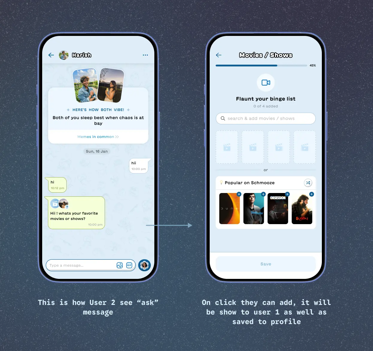
Two problems that looked separate turned out to be the same one. We wanted people to fill in their profiles. People in chatrooms wanted to know more about the person they'd just matched with. Same gap, opposite sides of it. So I let the user do the asking. If your match's profile was missing a bingelist, a playlist or a prompt, you could ask them for it directly.
The approach: We decided to keep it to those three on purpose. They're the fun parts of a profile, the ones that feel like sharing rather than filling a form. Prompts came from a question bank we'd already built, so the ask could be playful instead of administrative. The whole thing was meant to feel more like a small game between two people than a data request.
It only showed up when something was actually missing from your match's profile. Not shown if part is already completed. Of the people who sent a request, 60 to 65% got an answer back through the "Ask" feature. That's likely an undercount. Someone could just reply with their playlist in the chat, which doesn't update profile and which we can't see, because we don't read messages. So the real answer rate is higher than what we could measure.
There was a second-order effect I was counting on too. A request gives two people something specific to talk about in a chatroom that might otherwise go quiet. And whatever comes back updates the profile, so a conversation between two people quietly improves the data for everyone who sees that profile later.
Lesson: Sometimes the most effective nudge isn't from the product at all. It's from the person on the other side of the screen, and your job is just to hand them the tool.
AI as a profile building co-pilot
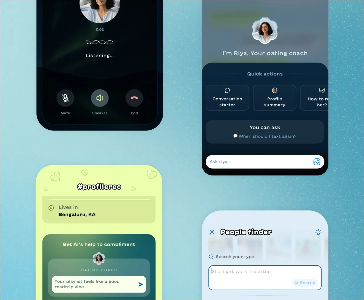
AI prompt builder
The problem: A well-written bio made a man 3x more likely to match within three days. Nearly half of WAU didn't have one. Prompt completion sat at 56%, and plenty of what did get written was too-short and low-effort. User can add up to three of them, and they do more work than anything else on a profile.
For women it worked differently, a good one didn't bring more matches, it brought better ones. We also saw people dropping UPI IDs, phone numbers and Telegram handles in there, some to move the chat off Schmooze, some to run a scam. That's a trust and safety problem of its own and it isn't what this feature set out to fix, but it told us how little the field was being treated as a bio at all.
AI prompt builder
The problem: A well-written bio made a man 3x more likely to match within three days. Nearly half of WAU didn't have one. Prompt completion sat at 56%, and plenty of what did get written was too-short and low-effort. User can add up to three of them, and they do more work than anything else on a profile.
For women it worked differently, a good one didn't bring more matches, it brought better ones. We also saw people dropping UPI IDs, phone numbers and Telegram handles in there, some to move the chat off Schmooze, some to run a scam. That's a trust and safety problem of its own and it isn't what this feature set out to fix, but it told us how little the field was being treated as a bio at all.
AI prompt builder
The problem: A well-written bio made a man 3x more likely to match within three days. Nearly half of WAU didn't have one. Prompt completion sat at 56%, and plenty of what did get written was too-short and low-effort. User can add up to three of them, and they do more work than anything else on a profile.
For women it worked differently, a good one didn't bring more matches, it brought better ones. We also saw people dropping UPI IDs, phone numbers and Telegram handles in there, some to move the chat off Schmooze, some to run a scam. That's a trust and safety problem of its own and it isn't what this feature set out to fix, but it told us how little the field was being treated as a bio at all.
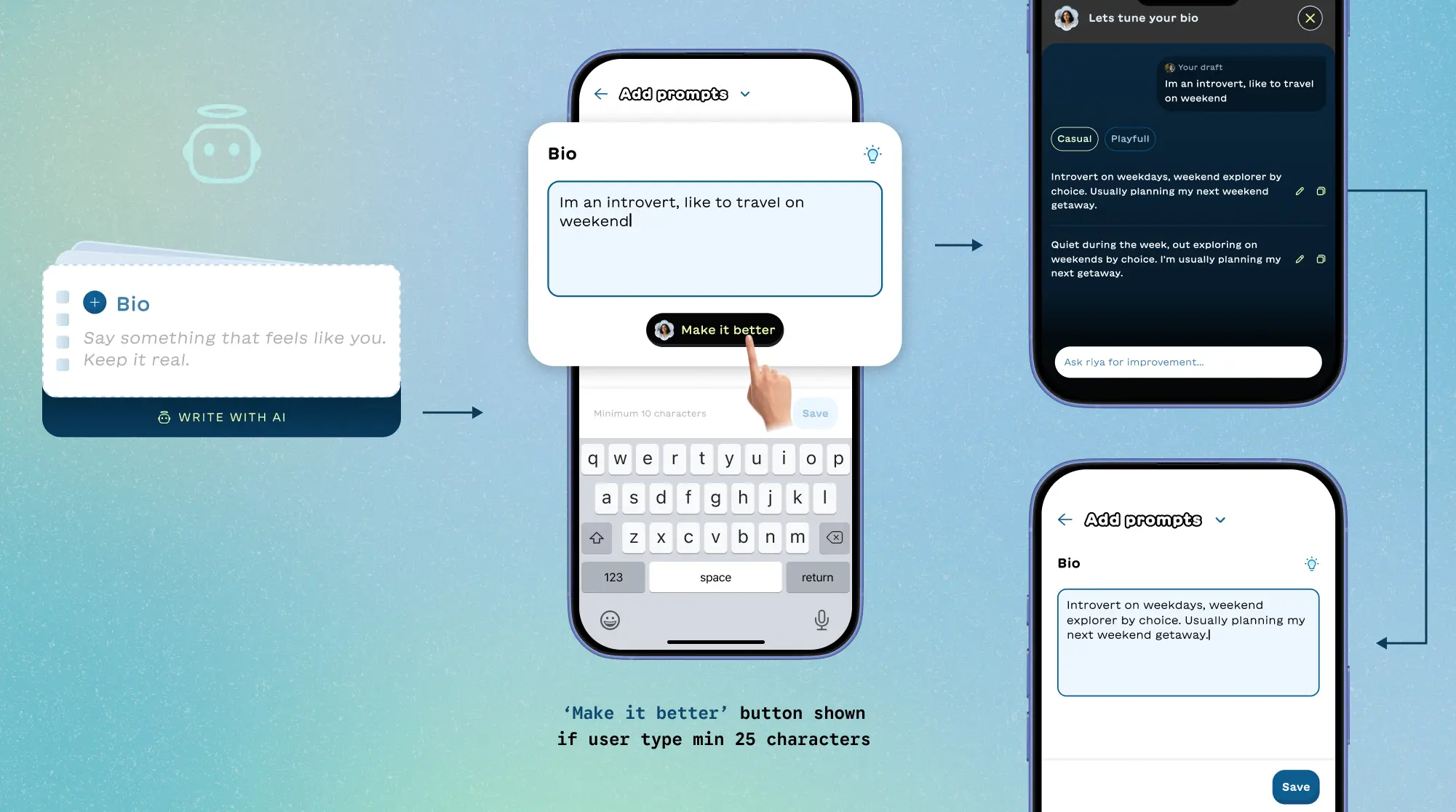
The approach: The rule I set first. The AI was never going to write your prompt for you. It augments what you've already written. That's why "Make it better" only appears once you've typed 25 characters. You bring something first.
Tap it and the AI checks what you gave it. Gibberish, emoji, a social handle, it won't polish any of that, it asks you to write something real. If there's substance, it rewrites in two tones: casual and playful. Playful came from the data, a lot of people were already trying to be funny, so we gave them a version that did it better. From there you can edit or steer it.
Maintanance: Keeping it good was the work. We measured output quality regularly and tuned the system prompt against what we found. The prompt carried a reference doc of good and bad examples, all curated from real user prompts. Changes went out staged and measured against the existing version before replacing it, especially model swaps.
Evaluation: I tracked match conversion on manually written prompts against AI-assisted ones. Manual sat at 22%, AI-assisted started at 16%. That gap was the real test of whether the AI was helping or just flattening everyone into sounding the same. Over time we closed it to within 1 to 2 points diff. Whether people used it mattered less than whether the output still worked on a human at the other end.
Impact: Prompt completion went from 56% to around 72% of WAU, Initially it was free, later it became part of the AI bundle which contributed to 5-10% of daily revenue.
AI Photo Selection:
Issue: Mixpanel showed people spending 5 to 10 minutes on the photo step, with the worst cases running much longer. We saw it happen in person during field interviews too, watching someone scroll their camera roll. That's not engagement. It is also a place more people giveup, dropoff, Some struggle to find the best picture of theirs easily. Schmooze allows up to 6 photos. On manual upload, the average was 2.5. Goal of this feature is to increase the Avg photo upload per user
The approach: Instead of scrolling your entire gallery, you take a selfie. The system scans your photos and surfaces the ones where your face matches, so the shortlisting is done for you. On privacy. All processing happens on device. Nothing is stored on a server, the sample selfie is never used on your profile, and every permission is asked for before anything runs. On a dating app, scanning someone's camera roll is a big ask, so the guarantees had to be visible on the screen where we made it.
AI Photo Selection:
Issue: Mixpanel showed people spending 5 to 10 minutes on the photo step, with the worst cases running much longer. We saw it happen in person during field interviews too, watching someone scroll their camera roll. That's not engagement. It is also a place more people giveup, dropoff, Some struggle to find the best picture of theirs easily. Schmooze allows up to 6 photos. On manual upload, the average was 2.5. Goal of this feature is to increase the Avg photo upload per user
The approach: Instead of scrolling your entire gallery, you take a selfie. The system scans your photos and surfaces the ones where your face matches, so the shortlisting is done for you. On privacy. All processing happens on device. Nothing is stored on a server, the sample selfie is never used on your profile, and every permission is asked for before anything runs. On a dating app, scanning someone's camera roll is a big ask, so the guarantees had to be visible on the screen where we made it.
AI Photo Selection:
Issue: Mixpanel showed people spending 5 to 10 minutes on the photo step, with the worst cases running much longer. We saw it happen in person during field interviews too, watching someone scroll their camera roll. That's not engagement. It is also a place more people giveup, dropoff, Some struggle to find the best picture of theirs easily. Schmooze allows up to 6 photos. On manual upload, the average was 2.5. Goal of this feature is to increase the Avg photo upload per user
The approach: Instead of scrolling your entire gallery, you take a selfie. The system scans your photos and surfaces the ones where your face matches, so the shortlisting is done for you. On privacy. All processing happens on device. Nothing is stored on a server, the sample selfie is never used on your profile, and every permission is asked for before anything runs. On a dating app, scanning someone's camera roll is a big ask, so the guarantees had to be visible on the screen where we made it.
Our engineers took it further on the ranking photos after processing, it prioritised recent trips and favourite albums, instagram folder and pushed group photos down, for better experience
What happened: We released on Android first, since an iOS policy issue blocked us there, which gave us room to test and iterate. Users who went through the photo picker averaged around 5 photos against 2.5 on manual upload. The photos were better too, more real, fewer group shots you can't pick anyone out of.
The selfie they uploaded for scanning also act as a verification photo, so one action did two jobs: more photos and a verified profile, without asking twice.
It shipped free, then became part of the premium AI bundle alongside Prompt Writer. Adoption dropped when it went behind the paywall, which we expected. As a part of the AI bundle which contributed to 5-10% of daily revenue.
Reflection: People weren't lazy about their profiles, they were stuck. One was stuck at a blank field, the other at a full camera roll. AI worked here because it removed the first step, not the whole effort.
Turning swipes into insight
How Schmooze works: Meme swiping is how Schmooze learns who you are. You can't get a match recommendation without it, so it sits right at the front of the experience and every downstream thing depends on it. Of everyone who finished onboarding, around 60% swiped the first set of memes to unlock a match. The rest got through signup and then stopped at the one action the whole product needs.
How Schmooze works: Meme swiping is how Schmooze learns who you are. You can't get a match recommendation without it, so it sits right at the front of the experience and every downstream thing depends on it. Of everyone who finished onboarding, around 60% swiped the first set of memes to unlock a match. The rest got through signup and then stopped at the one action the whole product needs.
The first fix was making the goal visible. Men needed 8 swipes to unlock profile recommendations, women 6. Nobody knew that. I added a progress widget showing how close you were to unlocking matches, and a quick gesture demo straight after onboarding so people arrived at the meme screen already knowing what to do rather than working it out cold. First match reaction rate went from 60% to 78%.
The second problem was further down. You get 6 to 8 profiles free a day. After that you can buy a 2x meme pack for another set of swipes, or wait for the next day's reset. That loop only works if people actually reach the end of their free memes, and only 26 to 32% of them did. Most people stopped well before they even use free profiles. So the question wasn't how to sell more packs. It was how to make swiping worth continuing on its own.
The first fix was making the goal visible. Men needed 8 swipes to unlock profile recommendations, women 6. Nobody knew that. I added a progress widget showing how close you were to unlocking matches, and a quick gesture demo straight after onboarding so people arrived at the meme screen already knowing what to do rather than working it out cold. First match reaction rate went from 60% to 78%.
The second problem was further down. You get 6 to 8 profiles free a day. After that you can buy a 2x meme pack for another set of swipes, or wait for the next day's reset. That loop only works if people actually reach the end of their free memes, and only 26 to 32% of them did. Most people stopped well before they even use free profiles. So the question wasn't how to sell more packs. It was how to make swiping worth continuing on its own.
Borrowed from experiment: We'd already seen the answer work. In the US product we'd shipped Schmooze Wrap, a year-end recap built from a user's swipe history, and people loved it. But a once-a-year moment doesn't help a daily loop. So for India I built a continuous version called Schmooze personality.
Swipe enough memes and you unlock a personality read built from what you found funny. There's no fixed threshold. The first one lands around 80 swipes, but the team kept experimenting with it, and it stretches if someone is rage-swiping, so it stays an earned thing rather than a drip. We had users at 44,000 swipes still unlocking them.
Keeping it honest was the work. A personality read is only as good as the signal under it, so we filtered for considered swipes over rage swipes, because someone flicking through 40 memes in a minute isn't telling you anything. We measured output quality on a cycle, tuned the system prompt against what we found, and added guardrails as failure modes appeared. Changes went out staged and were measured against the existing version before replacing it. The card itself carried the feedback loop: you could mark it "me" or "not me", and write something back. That's what we compared against over time.
Borrowed from experiment: We'd already seen the answer work. In the US product we'd shipped Schmooze Wrap, a year-end recap built from a user's swipe history, and people loved it. But a once-a-year moment doesn't help a daily loop. So for India I built a continuous version called Schmooze personality.
Swipe enough memes and you unlock a personality read built from what you found funny. There's no fixed threshold. The first one lands around 80 swipes, but the team kept experimenting with it, and it stretches if someone is rage-swiping, so it stays an earned thing rather than a drip. We had users at 44,000 swipes still unlocking them.
Keeping it honest was the work. A personality read is only as good as the signal under it, so we filtered for considered swipes over rage swipes, because someone flicking through 40 memes in a minute isn't telling you anything. We measured output quality on a cycle, tuned the system prompt against what we found, and added guardrails as failure modes appeared. Changes went out staged and were measured against the existing version before replacing it. The card itself carried the feedback loop: you could mark it "me" or "not me", and write something back. That's what we compared against over time.
Borrowed from experiment: We'd already seen the answer work. In the US product we'd shipped Schmooze Wrap, a year-end recap built from a user's swipe history, and people loved it. But a once-a-year moment doesn't help a daily loop. So for India I built a continuous version called Schmooze personality.
Swipe enough memes and you unlock a personality read built from what you found funny. There's no fixed threshold. The first one lands around 80 swipes, but the team kept experimenting with it, and it stretches if someone is rage-swiping, so it stays an earned thing rather than a drip. We had users at 44,000 swipes still unlocking them.
Keeping it honest was the work. A personality read is only as good as the signal under it, so we filtered for considered swipes over rage swipes, because someone flicking through 40 memes in a minute isn't telling you anything. We measured output quality on a cycle, tuned the system prompt against what we found, and added guardrails as failure modes appeared. Changes went out staged and were measured against the existing version before replacing it. The card itself carried the feedback loop: you could mark it "me" or "not me", and write something back. That's what we compared against over time.
What happened: Free meme exhaustion went from 28% to 38-42%. Overall meme swipe rate went up. And around 65% of people who unlocked an Insight added it to their profile, which is the part I cared about most: a profile field nobody had to be nudged into filling, because they'd earned it rather than been asked for it. The cards were shareable, and the share funnel into Instagram and other socials was strong. Free marketing, paid for in self-expression. We called it a joy metric.
What happened: Free meme exhaustion went from 28% to 38-42%. Overall meme swipe rate went up. And around 65% of people who unlocked an Insight added it to their profile, which is the part I cared about most: a profile field nobody had to be nudged into filling, because they'd earned it rather than been asked for it. The cards were shareable, and the share funnel into Instagram and other socials was strong. Free marketing, paid for in self-expression. We called it a joy metric.
Reflection: People added it to profile because it was theirs, not because we asked. Give data back in a shape someone wants.
When gamification backfired
Three behavioural problems, People rage swiping through memes without looking at them. Profiles left half-finished. And the usual trust and safety mess: scam attempts, people getting reported, bad behaviour in chat.
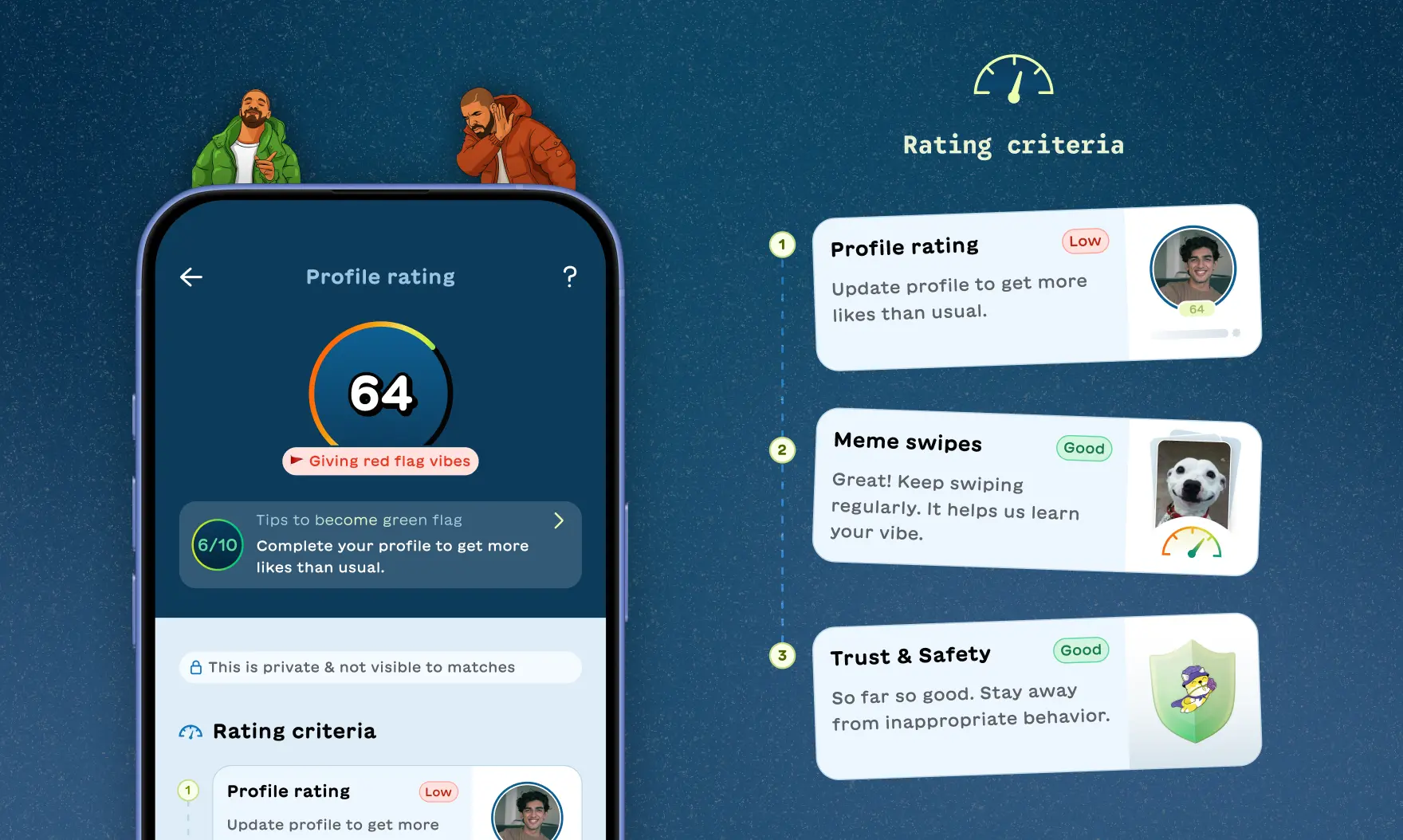
The theory. Fix all three with one thing. A single score covering meme swiping, profile quality, and trust and safety, visible to the user. Give people a score and they'll want to improve it. It was elegant in that way doomed theories often are.
How it worked: The score was visible to you but private, nobody else could see it. It moved in both directions. Swiping memes regularly, getting your profile to 100%, completing verification, all pushed it up. Rage swiping pushed it down. So did failing face verification twice in a row, which usually meant a scam attempt, or getting reported by several people.
What happened. It moved one needle out of three. Meme swiping improved. Time between swipes went up, which is the clearest sign rage swiping had dropped, because someone actually looking at a meme takes longer than someone flicking past it. Profile quality and trust and safety didn't move. A number on a dashboard turned out to be too abstract to change how someone behaves in the moment they're behaving badly.
What came out of it anyway. Some people kept rage swiping regardless, and rather than keep pushing them toward a behaviour they clearly didn't want, we built them a way around it. Shortcuts let you pay to see daily curated matches directly, no swiping. It became around 15% of daily revenue.
What survived: We stripped the dashboard and kept the parts that worked, rebuilt as individual moments instead of one score. A nude image sent in chat gets flagged straight away and arrives blurred on the other side. Match Age range warnings appear right under the selector as you set it.
Lesson: Not every problem wants to be gamified. A score with no clear payoff just adds noise. Some problems need their own treatment.